Mixing Quiet Colours: How to Build Neutrals Without Making Mud
A useful neutral is rarely a dead grey. It may lean toward violet in a shadow, green beside warm skin, or blue under an orange light. These quiet shifts help bright colours feel brighter and make a painting belong to one atmosphere.
“Mud” is not simply brown or grey paint. Mud is a mixture that has lost a clear role. It is the wrong value, temperature, or intensity for the place where it is used. The solution is not to avoid neutrals; it is to mix them with a specific destination in mind.
Start with a two-colour parent mixture
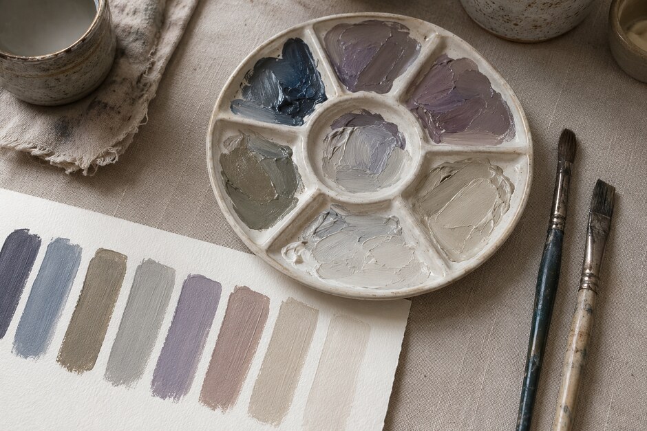
Choose a pair that roughly opposes each other on the colour wheel: ultramarine and burnt sienna, a cool red and a muted green, or yellow ochre and a restrained violet. Mix equal-looking amounts in the centre of the palette, then shift the mixture toward one parent colour on either side.
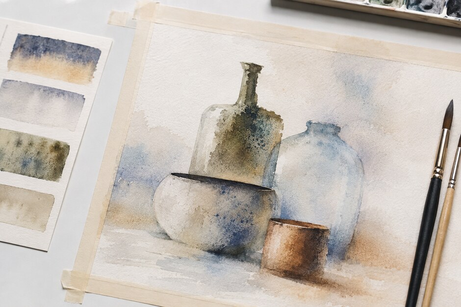
You should produce a small family: a warm neutral, a balanced neutral, and a cool neutral. The middle mixture does not need to be perfectly grey. Its slight bias is often what makes it useful.
Separate hue, value, and opacity
Three different changes are often confused on the palette. Adding a complement reduces intensity. Adding white raises value and usually cools the mixture. Adding more medium changes transparency without necessarily changing the underlying hue.
Test these changes in separate rows. In the first row, alter only the balance between the two parent colours. In the second, add increasing amounts of white. In the third, thin the original mixtures to reveal the paper or ground. Label the rows later if you wish, but keep the mixing process separate while you work.
Use a clean mixing zone
A palette becomes unpredictable when every new mixture picks up fragments from several old ones. Reserve one clean area for each neutral family and wipe the knife or brush before changing direction. Mix enough paint to make a visible decision. Tiny mixtures dry quickly and encourage constant correction.
If a mixture feels dull, do not immediately add more colours. Ask what is missing. Does it need to be lighter, warmer, cooler, or slightly more saturated? Answer with the smallest possible addition.
Compare neutrals beside a reference colour
A neutral cannot be judged in isolation. Paint a small strip of a strong reference colour, then place three neutrals beside it. A blue-grey that seems colourful on a white palette may behave almost grey beside orange. A warm stone colour may become distinctly green beside red.
This comparison is more reliable than trying to decide whether a mixture is “interesting.” The neighbouring colour tells you what the neutral is doing.
Build a five-mixture working set
For a compact study, prepare five mixtures before painting:
- a light warm neutral;
- a light cool neutral;
- a middle-value neutral close to the dominant local colour;
- a dark warm neutral;
- a dark cool neutral.
These are not fixed swatches. They are starting points that keep every passage from being mixed independently. The result usually feels more coherent because the colours share parents.
Protect the brightest accents
Reserve the most saturated colour until the broad neutral relationships are established. A small clean accent gains strength when the surrounding passages are controlled. If every area begins at full intensity, later mixing often becomes a long attempt to reduce competition.
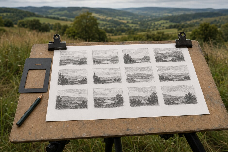
The same hierarchy can be planned in miniature. The twelve-box method in Plan a Plein-Air Painting in Twelve Tiny Thumbnails is useful even in the studio: decide where the strongest contrast belongs before spending paint on detail.
Rescue a mixture deliberately
When a pile truly becomes unusable, set part of it aside instead of endlessly correcting the whole amount. Place three small samples on the palette. Push one warmer, one cooler, and one lighter. One branch may become a valuable shadow or background colour even if the original mixture failed.
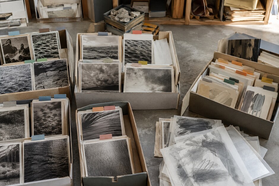
Record the successful pairings with an actual dried swatch. Photographs rarely capture subtle neutral shifts accurately. A physical archive, organised as described in Build a Personal Reference Library, becomes a practical map for future paintings.
Quiet colour is not colour with the life removed. It is colour with its volume adjusted. Mix from clear parent relationships, change one variable at a time, and judge every neutral beside the colours it needs to support.