Edges Before Details: A Watercolour Exercise for Depth and Focus
Watercolour detail attracts attention because it feels controllable. A small dark line can sharpen a rim or describe a handle in seconds. But when every boundary receives the same treatment, the painting becomes flat no matter how accurate the drawing is.
Depth depends on edge variety. A crisp boundary advances, a soft transition turns or recedes, a broken edge flickers, and a lost edge allows two areas to join. This exercise plans those relationships before decorative information takes over.
Choose overlapping forms
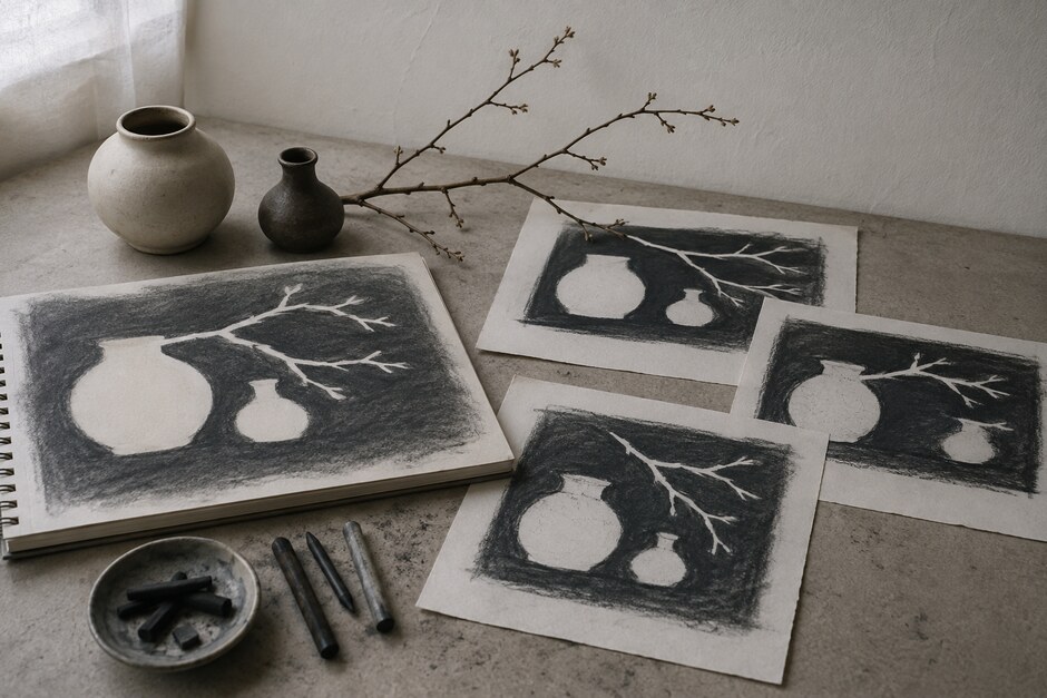
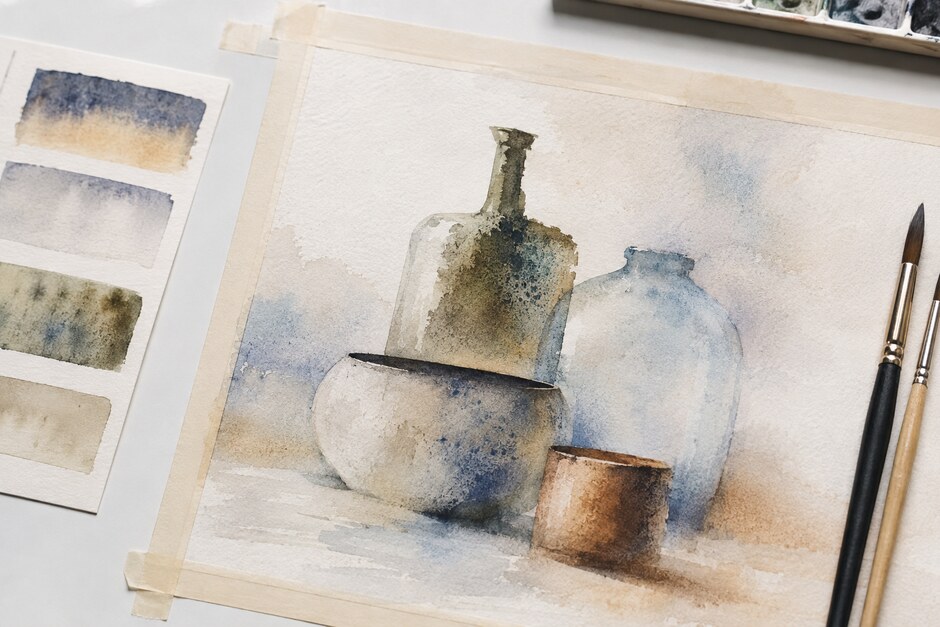
Arrange three pale vessels or boxes so that one overlaps another. Place the group against a simple background and use side light. The subject should offer one clear focal overlap, one quiet outer edge, and at least one place where object and background have similar value.
Make a light pencil drawing on cold-press paper. Indicate only the major shapes. Heavy outlining will make it harder to let boundaries disappear later.
Create an edge map
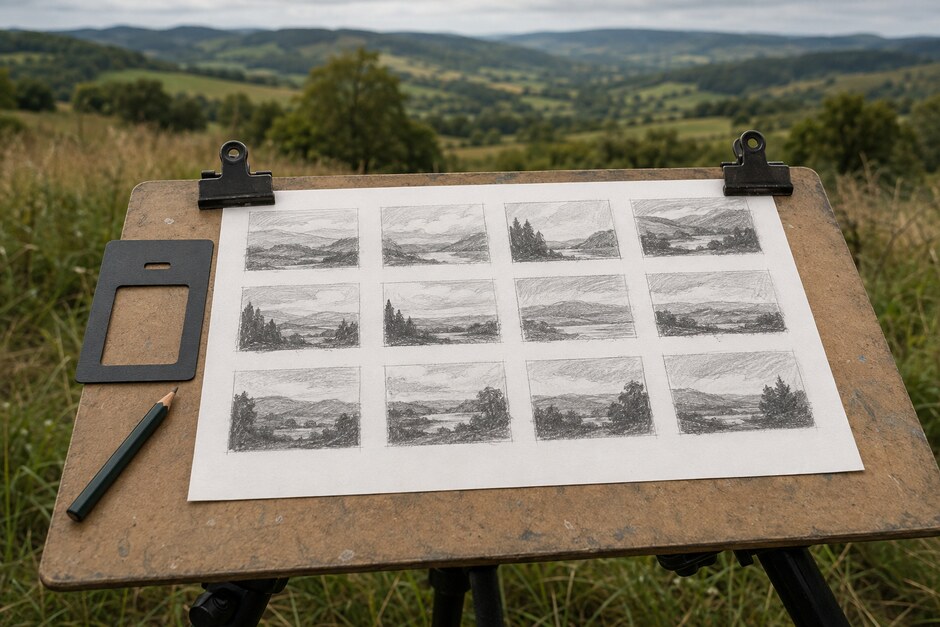
On a thumbnail, mark each important boundary with one of four signs: H for hard, S for soft, B for broken, and L for lost. Choose one small area for the hardest edge. Keep most transitions soft or understated.
The map is a hierarchy, not a technical checklist. You do not need equal numbers of each edge. You need enough variation to direct attention.
Practise the timing on a strip
Before touching the main sheet, paint four adjacent rectangles on scrap paper. For a hard edge, place a wet stroke on dry paper and leave it alone. For a soft edge, dampen the neighbouring area with clean water and allow pigment to travel into it. For a broken edge, skip small sections with a nearly dry brush. For a lost edge, paint both sides while damp so the boundary merges.
Watch the surface sheen. A glossy wash moves quickly; a satin sheen softens with more control; a nearly dry surface produces a narrow feather. Watercolour edges are largely decisions about timing.
Paint connected light shapes first
Begin with a pale wash that passes through the background and the light sides of the objects. Do not stop automatically at every pencil line. Connecting similar light values gives you places where an edge can disappear naturally.
Let the wash dry completely. A cool surface can feel dry while still releasing moisture into the next layer, so wait longer than seems necessary.
Build the focal overlap
Mix a middle-value wash and paint the form that sits behind the focal object. Work toward the chosen boundary and keep that edge clean. On the opposite side, touch a damp brush to the wash and pull the transition outward so it softens.
The same shape now performs two jobs: it clarifies the overlap at the focal point and turns away quietly elsewhere.
Lose an edge deliberately
Find the place where an object and the background share a similar value. Paint across the boundary with one mixture, then adjust colour or temperature inside the still-wet area without restoring a line. The object should remain understandable because other edges and overlaps provide enough information.
If the form disappears too completely, wait until dry and add one short broken mark rather than redrawing the whole contour.
Reserve dark accents until the structure works
Step back before adding the deepest value. Can you identify the overlap? Does one area attract attention first? Do some forms sit farther away than others? If the answer is no, change an edge rather than adding texture.
Place the final dark in two or three connected accents near the focal area. A small crisp note is powerful because softer transitions prepare the eye for it.
Compare the painting in grayscale
Photograph the study and view it without colour. This reveals whether the lost edges are supported by value grouping or merely hidden by attractive colour. The negative-shape checks in Drawing the Space Between Things can help repair awkward intervals without outlining every object.
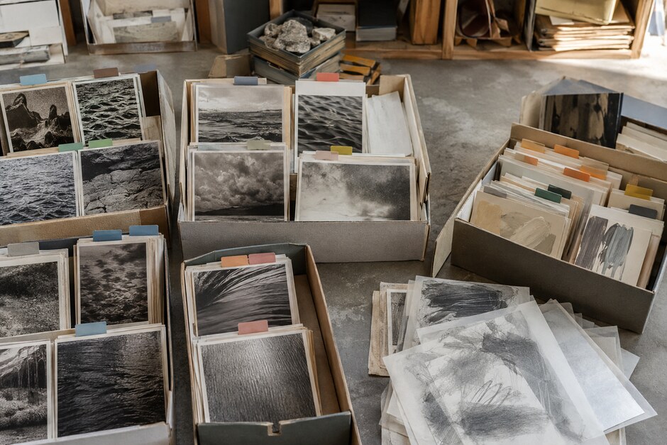
Keep the scrap strip beside the finished study. File both under edges or water control using the system in Build a Personal Reference Library.
A convincing watercolour does not explain every boundary. It gives the eye a few precise places to land, then lets water, value, and timing carry the rest of the space.